Oversight during agency engagement.
As the in-house brand person for this IT Services consultancy, I oversaw an agency engagement.
How we rebranded in a no-holds-barred sprint to the finish line.

Auditing Tampa’s Brand Agencies
As the in-house brand director for this IT Services consultancy, I oversaw the process of a rebranding engagement with a Tampa-based agency.
Founder and CEO Bryon Kroger brought me into his startup early because he felt that an intentional and well-curated brand was going to be the ticket to their heads rising above a sea of noise in the GovTech space. Bryon was about to choose an agency and wanted a brand person on his side of the fence to manage the process and be there to catch this baby when it was born.
I did an audit of the 3 agencies that Bryon shortlisted. As the over-communicating over-achiever that I am, I formulated a 14-page agency audit with a rating system and comparative analysis to show how the agencies stacked up in terms of:
Ad Creative
Brand
Copywriting
Culture
Design
Empathy
Inclusive Design
Logos
Market Exposure
Maturity
Team Diversity
Tech
UX
This was a somewhat ruthless deep dive into the seen and unseen things inside the proposed agencies. A look under the hood.
When I look under the hood of many agencies, I find that they don’t have practices that match the values they want to have. Wanting and doing are two very different things.
While only days into my role, I already knew that Rise8 were doers who would want anyone looking under their hood to find that even the things that aren’t instantly visible are honorable, pressure-tested, and trustworthy. So we needed to align with a partner who matched our attention to detail and obsession with honesty.
Working as a creative producer in media for the length of time I have, I’ve worked with agencies. I’ve worked in agencies. I’ve worked for agencies. And, in this case, I was the client hiring an agency.
Doing this agency audit, while intensely fun, was also hard. Hard to not want to be the one who patted every agency on the back. I want them all to succeed. I wanted them all to get the job as the partner who would take Rise8 through our branding adventure. Yet, when I took a closer look, I saw opportunities for growth that made most not appear ready to work with a brand that serves the largest enterprise on the planet: the US Government.
Rise8 does really important work. They’re enabling teams to deliver software that saves lives and valuable resources. They can take a clunky process and turn it into a slick machine -a software factory- and do it really effin fast.
I felt the pressure to make sure we hired the best agency for the job. One who put their money where their mouth was. Whose background and experience spoke for themselves. An agency with a well-oiled machine under the hood.
In my audit of agencies, one stood head and shoulders above the others.
For me, the clear winner was Spark. In the summary of my 14-page agency audit, I said:
“Without a doubt, the clear winner for me in terms of brand development is Spark. They get it. They practice what they preach. They put their money where their mouth is. They exercise diversity in hiring and in their work. Their founder is from Grey, a prestigious agency founded in 1917.”
A couple of areas stood out to me particularly when it came to Spark: culture and design.
Why rebrand?
When we started the rebranding process, Rise8 had a logo, a set of Google fonts, and a color: red. They also had a team of people who were communicating with customers daily, a LinkedIn page with not much going on, and a lot of work going out into the domain in the form of documents, slide decks, and marketing one-pagers.
They were also about to be awarded a federal contract that was going to set a lot of eyes on them. They had no brand to speak of and a website that didn’t align with who they were. They needed the rebrand to happen yesterday.
How long did it take?
All told, the process took 9 months which is twice as long as we wanted, but also pretty perfect since I always think of this process like making a baby.
A rebranding process consists of:
Discovery (Conception)
Foundations (Gestation)
Identity (Labor)
Activation (Delivery)
Starting position: The Rise8 brand as it stood
When we started the rebranding process, Rise8 had a logo, a set of Google fonts, and a color: red. They also had a team of people who were communicating with customers daily, a Linkedin page with not much going on, and a lot of work going out into the domain in the form of documents, slide decks, and one-page sell sheets.
They were also about to be awarded a federal contract that was going to set a lot of eyes on them. They had no brand to speak of and a website that didn’t align with who they were. They needed the rebrand to happen yesterday.
In the meantime
We didn’t have time to wait for the rebrand with Spark to get something going. So I launched what we started calling “the interim brand”.
Within a couple of weeks, I had designed a new brand bible, Google templates for slide decks/documents, and delivered brand training to the team. The night before we announced the new federal contract, Bryon pulled an all-nighter and launched a fresh website for the interim.
We didn’t announce this new website or direct any traffic there. We did a dark update with the intention that it would be there in the event that our contract award caused a spike in traffic. We were right. It did.
Phase 1: Discovery & Positioning
“Your brand is what people say about you when you’re not in the room.” -Jeff Bezos
How do you know what people say about you when you’re not in the room? You get someone to ask them. And stay out of the room.
The conception phase of this rebrand started with a phase of discovery which informed our choices regarding positioning. Discovery digs up things we have little control over (what people say about us when we’re not in the room) and, armed with those insights, we’re able to then make choices about how we’re going to position ourselves for the future to influence what people say about us from that point on.
We carried out:
Market research
Customer interviews
Brand audit
The end result was:
Insights about our audience
Choices for how we position ourselves to meet the needs of this audience
To me, this is the most important and exciting part of a branding exercise. This is where we learn if people experience us the way we hope they do. This is where we learn if what we think we are matches what they think we are.
What we think doesn’t matter if it doesn’t land that way with our audience. If we think we’re fast but customers don’t experience us that way, then we are not fast.
The insights gained from this phase informed the entire process which followed. In the final product, the words you hear Rise8 saying, the things you will see on our website…these came directly from their customers and peers. They are what people say about us when we weren’t in the room.
I’d like to take a moment to contrast this with a previous experience I had in a rebrand process. I once led a rebrand for a services business that thought they were high-end. They believed that customers saw them as the premier option.
When I carried out a listening exercise, I discovered that, in fact, the brand was seen as the budget option. At this point, we had three options:
Kick against what our customers are telling us and continue to be something we weren’t.
Change everything to become the brand we thought we were.
Correct course and live the truth our customers were sharing with us.
For that brand, we did the honest thing. We said, “Hey, ok we’re picking up what you’re putting down. We’re cheap and fast.” We repositioned to mirror back to our customers what they shared with us and the business exploded in new growth. In every market, there is room for a cheap and fast option.
I always tell people: “Good. Fast. Cheap. You can pick two.” While that brand was fast and cheap, Rise8 was fast and good.
In short, if you do a listening exercise and you discover that your customers and peers don’t think about you how you think about yourself, don’t be too proud to adjust your messaging to meet their experience of you.
This, however, wasn’t the case with Rise8. I thought they were hot. Turns out, they were hot.
Armed with the insights from discovery, we set out to work through what to do with those insights. We now know what people say about us when we’re not in the room. What do we do with that information?
Positioning is about laying all options on the table for the ways in which we position ourselves in the marketplace. Having also done a heavy audit of other brands in our ecosystem, we were able to identify holes in the market in terms of how these brands positioned themselves. Once we identified those gaps in the market, we could find which gaps we fill and then commit to one. This commitment would become our north star.
Our north star was clear: Continuous impact
Phase 2: Foundations
With our north star in place and our compass calibrated, we started the longest phase of all: developing the building blocks of the brand — the brand foundation. Time to give this baby a beating heart.
This is important because the results of this work will inform all future brand communications. The output of this phase was the:
Brand story
Brand promise
Brand values
Brand voice and tone
We co-labored to end up with pages and pages of copy that accurately reflected our story, values, and promise for all different audiences. Something very important about the final delivery of this phase was that we remember that we were speaking to many different audiences including federal customers, end-users, and recruits. All of these points of view were considered in the penning of these words and that really spoke to the empathy I wanted to see in this brand.

Phase 3: Identity
This is where labor begins in earnest and we get to see the fruits of the last few months take shape visually.
Building upon our positioning, story, and values, our agency partner worked with us to develop the visual manifestation of the brand:
The logo
Fonts
Colors
Assets like textures, icons, and other artifacts
Usage guidelines (aka brand bible)
To describe the visual direction of our brand is to say that the direction utilizes mirroring & pairing to represent our approach to creating impact.
The logo comes in two parts:
A wordmark
A logomark
There is a greater Rise8 logo and an artifact -a lone 8- which can be used on its own. The 78º slant is a nod to the origin of our name, the proverb “fall 7, rise 8”. The two sides of the 8 represent pairing.
Phase 4: Activation
The final phase is to deliver it all into the world and this is where I, as a brand person, catch the baby and take over. Without me in the picture, Rise8 would have continued working with outside suppliers to activate the brand and turn it into social media interactions, video content, blog posts, etc. These engagements would require teams of many people and lots of cash. Or one in-house brand director.
At this point, armed with a library of assets and very specific guidelines for how they are to be used, I set out to achieve a number of things:
I archived all old brand (aka “legacy”) assets.
I provided the team with new templates.
I set out to update slide decks we use regularly, some with an eye-watering 100+ slides.
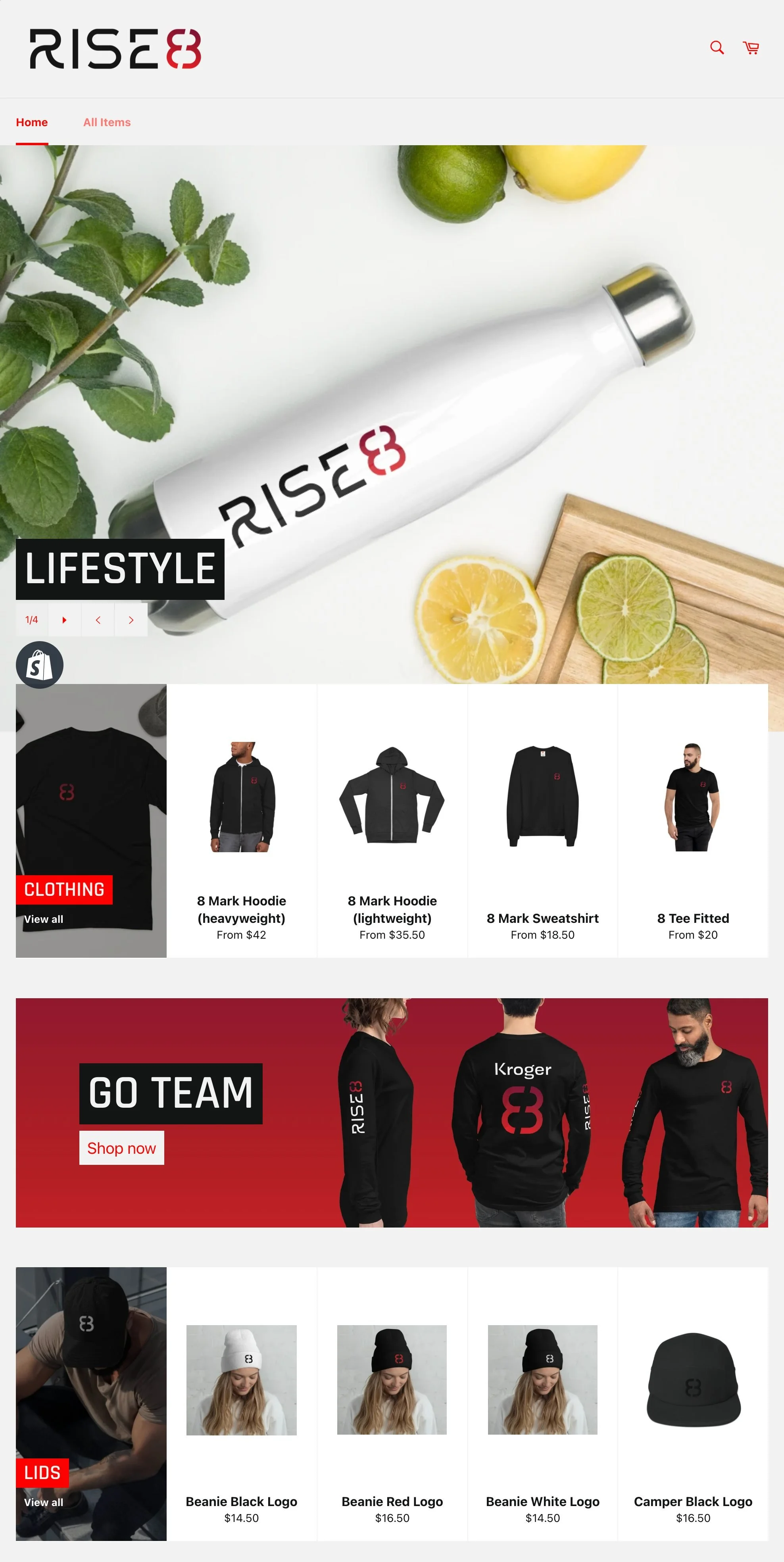
I created a Shopify storefront for Risers to access branded items for their clothing and lifestyle.
I strategized and launched a rollout for our external audience
In the end, the Rise8 brand turned out to be incredibly honest and masterfully turned out. It’s classy and elevated, inwardly serious and outwardly spirited just like Rise8.